


Verdure Estuary Watch Review
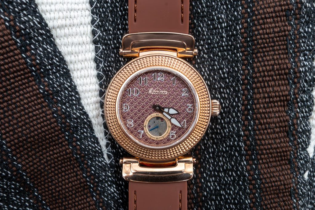
The first impression wasn’t about specs, lineage, or even the movement. It was that moment when the dial caught light and turned it into motion, those sculptured fish scales behaving more like shifting water than a static pattern. There’s an immediate sense that this isn’t a loud piece, but it’s also not trying to disappear.
I’d had this model on my mental shortlist for a while, the kind of watch you keep circling because the design idea is specific and, if it’s executed well, hard to replace. The Estuary finally landed in my hands and, within minutes, I knew it wasn’t just another “nice concept.” It’s a carefully finished piece with unusually strong presentation. In a brand lineup where packaging can be an afterthought, this one arrives like Verdure meant it.
The One That Wouldn’t Let Go

Verdure sells the Estuary under its Lure Collection, and the watch makes sense in that context. The color palette, case details, and dial treatment lean into the “attraction and allure” language Verdure uses for the collection, but the execution is calmer than that phrasing suggests. Verdure also calls it a “treasure piece” in the catalog, which is bold wording, yet not out of place here.
My interest was simple: I wanted to see whether the sculptured fish scale dial would hold up beyond a few photos and a quick glance. Texture like this can fall into novelty fast. It can also become the thing you look for on your wrist, day after day, because it doesn’t repeat itself.
When the watch finally arrived, I did what I always do with a piece I’ve waited on: I slowed down. I cleared the table, opened it in decent light, and gave it a few minutes before I even put it on. Some watches win you over through specs. This one wins you over through restraint and detail, then backs it up with real-world practicality.
When Texture Becomes the Story
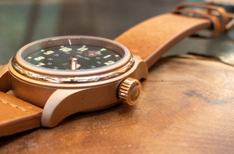
The Estuary’s identity lives and dies with its sculptured fish scale dial. Verdure made the right call by keeping the rest of the design controlled. The fish scale texture is the statement, so the brown and rose gold palette works as a frame rather than a competing idea. In brighter light, the dial has a shifting quality that feels intentional, not flashy. Under softer indoor lighting, the texture doesn’t disappear, it just quiets down, which is exactly what you want from a watch you plan to wear outside of “watch moments.”

The coastal inspiration Verdure leans on could have gone sideways into theme, but the Estuary doesn’t try to cosplay a beach. It reads more like coastal design in the architectural sense: natural tones, a sense of calm, and the suggestion of water through pattern rather than illustration
Over a few wears, what I noticed most was consistency. The dial stays interesting without demanding attention. That balance is rare. Plenty of textured dials look great once, then feel busy. Here, the pattern behaves more like a surface treatment than a graphic, which keeps the watch wearable across settings where you’d normally default to something plain.
Forty Millimeters With Intent
Verdure sized the Estuary at 40 mm in a stainless steel case, with a 22 mm band size. On paper, that can sound like “standard modern,” and in practice it lands that way too. It has presence without feeling like a billboard, and it sits in the category where you can wear it all day without constantly adjusting your sleeve or thinking about whether you chose the wrong piece for the day.

The strap choice matters here. The Estuary comes on a vulcanized rubber strap, which immediately pushes it away from being a delicate dress watch and into something more functional. The brown strap works with the brown and rose gold palette, and the rubber keeps the whole package grounded. You can wear it with a more casual uniform and it makes sense. It can also clean up well when you need it to, mostly because the dial and color palette carry themselves with enough polish.
The case finishing reads clean and deliberate. At $1,199, I’m looking for control: crisp transitions, nothing that feels wobbly or rushed, and a general sense the brand knows what it’s trying to be. The Estuary clears that bar. It feels like a complete product, not just a design wrapped around a movement.
Small Seconds, Big Payoff

The Estuary places a sub-seconds hand at 6 o’clock. That single choice changes how the watch wears, because it gives the dial a second point of focus without disturbing the main time display. On a textured dial, this is a smart move. It adds structure.
In daily use, I found myself checking the small seconds more than expected, not because I needed it, but because it adds a subtle sense of motion. The fish scale texture is already doing something visually, and the sub-seconds gives that texture a rhythm. The watch feels alive without needing loud colors or aggressive hardware.
Legibility stayed solid across normal conditions. The design doesn’t ask you to decipher it. The dial texture is present, but it doesn’t clutter the read. This is where Verdure’s “elegance in simplicity” marketing line holds. The Estuary isn’t minimalist in the strict sense, but it is composed. Nothing feels like it was added to fill space.
If you like watches that look calm at a glance but reward a closer look, the Estuary hits that. The sub-seconds at 6 o’clock is part of that reward.
Movement, Feel, and Everyday Behavior
Inside, the Estuary runs an automatic movement specified as ST1701. I’m not interested in romanticizing a movement by name alone. What matters day to day is how the watch behaves on the wrist and in the hand.
Setting it is straightforward, helped by the screw-down crown. The crown action feels purposeful: you engage it, you do what you need to do, you secure it again. That is part of the watch’s broader practicality, and it pairs well with the Estuary’s 10 ATM water resistance rating. I didn’t treat it like a fragile object. Rain, handwashing, the normal realities of travel and daily movement didn’t prompt any second-guessing.

The automatic nature of the movement suits the concept, too. This isn’t a piece that begs to live in a box between “occasions.” It’s built to be worn regularly, and an automatic movement fits that pattern.
One small human note: the butterfly clasp takes a moment to learn. The first couple of times, I had to slow down and pay attention to how it wanted to close and open. After that, it became routine, but it’s not the kind of clasp you operate half-asleep on day one. It’s minor, and it’s the only friction point I ran into.
Learning the Strap’s Rhythm
The Estuary pairs its vulcanized rubber strap with a butterfly clasp. Conceptually, I’m ok with that combination. The rubber keeps the watch practical and comfortable, while the butterfly clasp gives the closure a cleaner look than a standard pin buckle.
In use, the comfort is the headline. Rubber straps can feel clumsy or overly sporty, but here the strap supports the Estuary’s coastal design intent instead of arguing with it. It wears easily for long stretches, and the 40 mm case doesn’t feel top-heavy on rubber, which can happen when a strap lacks structure.

The butterfly clasp is the part that asks for patience. The learning curve is brief, but it exists. Once it clicked for me, it felt secure and tidy, and it helped the watch feel more finished as an object. A butterfly clasp also has a way of keeping the watch looking “complete” on the wrist since you don’t have the same visual interruption you get from a traditional buckle.
Verdure made a functional choice here, not a fussy one. It aligns with the Estuary’s broader personality: polished, but not precious.
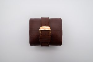
A Box That Means Business

Presentation is where the Estuary separates itself from what I expect at this level, and even from Verdure’s own lineup. The box is the best and most well-constructed packaging I’ve seen from the brand. Not “nice for the money.” Not “better than last time.” It sets a higher standard.
The build feels solid in the hand, with clean construction and a sense that the interior was designed around the watch rather than the other way around. The watch sits presented, not stuffed, and the overall impression is of a brand that understands the ritual matters. If you’re asking someone to spend $1,199, you need to signal care before the watch even touches skin. Verdure does that here.
On the practical side, the Estuary product page states orders ship within 3 business days unless otherwise specified, and returns are allowed within 15 days of purchase, with duties and taxes non-refundable. Verdure also links out to its Terms & Conditions, Shipping Policy, Return & Exchange policy, and Privacy Policy for the full details. Contact information is clear as well: Verdure lists an address at 190 Moore Street, 270, Hackensack, New Jersey 07601, and a phone number (+1 201-294-3859) plus an email (info@verdurewatches.com).
Those basics are easy to overlook until they aren’t. Here, the operational side matches the care shown in the presentation.
Price, Position, and the Right Wrist
![]()
The Estuary is listed at $1,199.00 on Verdure’s site, offered in a single product variant labeled “Default Title.” That price forces a simple question: does this feel like a complete, defensible product at that level? In my view, yes, primarily because the watch isn’t leaning on one trick. It has a distinctive dial, a cohesive brown and rose gold palette, a stainless steel 40 mm case, an ST1701 automatic movement, 10 ATM water resistance, a screw-down crown, and a strap and clasp choice that support daily wear.
In the independent watch market, $1,199 sits in a zone where design has to be more than competent and construction has to feel considered. The Estuary’s strongest argument is coherence. It looks like someone designed it with a clear philosophy, then followed through on the physical object and the way it arrives.
This watch suits someone who wants a daily piece with personality but not noise. If you want a loud status signal, it’s not that. If you want a coastal-inspired design that reads as calm, polished, and wearable, it lands. One more practical note: when I checked the product page, Verdure indicated 49 units left in stock. I don’t treat scarcity as a virtue on its own, but it does explain why the Estuary can be easy to miss until you go looking for it.
Final Thoughts
The Verdure Estuary is a watch that rewards patience, both in the waiting and in the wearing. The coastal design philosophy is present, but it’s expressed through disciplined choices: a sculptured fish scale dial that changes with light, a brown and rose gold palette that feels warm rather than trendy, and a layout anchored by a sub-seconds hand at 6 o’clock. The underlying platform is practical: a 40 mm stainless steel case, an ST1701 automatic movement, a screw-down crown, and 10 ATM water resistance. It’s built to be worn, not stored.
The one small adjustment is the butterfly clasp, which takes a beat to learn. Past that, the watch settles into a routine quickly.
The strongest surprise is the presentation. Verdure’s box for the Estuary is the best and most well-constructed in the lineup, and it sets a tone the watch itself can back up. If you’re considering this at $1,199, it makes sense for someone who values design texture, calm color, and day-to-day utility in the same object. If you want your watches to shout, skip it. The Estuary doesn’t shout. It stays interesting, then lets you get on with your day.